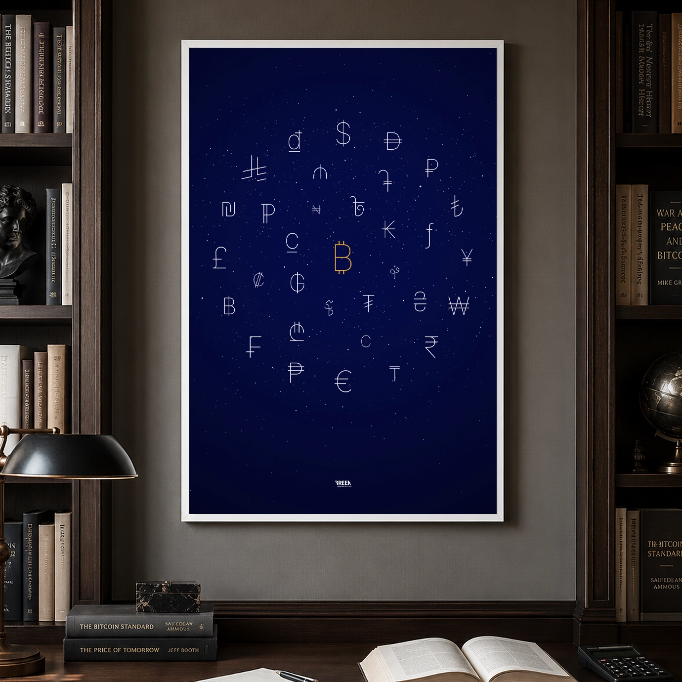
Bitcoin Currency Symbols Poster
33 currency symbols. One centre of gravity. A typographic bitcoin poster that places the ₿ among 32 fiat signs - bitcoin wall art for people who see money differently.
Handmade in Holland
Product Details
Size
A2 (420 × 594 mm / 16.5 × 23.4 in)
Paper
200gsm matte finish, minimal
reflections
Print
Giclée fine art - the same archival method used by museums
and galleries
Shipping & Returns
Shipping
Orders ship within 2–5 business days from the
Netherlands. €4.90 NL / €9.90 EU / €14.90 ROW.
Delivery
EU: 3–7 business days. UK/US/CA: 5–12 business days.
Rest of world: 7–21 business days.
Returns
If your poster arrives damaged or misprinted, email a
photo within 30 days and we'll send a replacement, no questions asked. Lost in
transit? We'll reship at no cost.
The idea behind this bitcoin poster
A small typographic mark that carries the
weight of a country, a central bank, a market, and millions of people pricing their time in it. That
simplicity is what pulled me to create this Bitcoin poster.
I wanted to make a Bitcoin poster that didn't look like the usual Bitcoin poster. No price
chart. No white paper layout. No giant coin. No slogan. Just the visual language of money, stripped
down to its smallest signs, with Bitcoin placed where I think it belongs: at the centre of gravity.

Bitcoin wall art for people who see money differently
This piece places the Bitcoin symbol among 32 fiat currency symbols. Together, they form a
loose orbit around the orange ₿. The other symbols are white, thin, and restrained. Bitcoin is
slightly larger, centred, and the only mark in colour.
That was the whole idea: Bitcoin as the fixed point in a world of currencies that keep
moving
around it.
Fiat money depends on trust, policy, debt, and expansion. Bitcoin is different. Its supply
is
fixed at 21 million, and its rules are enforced by a decentralised network rather than a central
bank
or company.
That difference is hard to show in a poster without turning it into a lecture. So I used
gravity.
The fiat symbols move around Bitcoin like matter around a black hole. They still have their
own shape and history. Some are beautiful. Some are strange. Some are almost plain letters with a
small intervention. But in this composition they are all being pulled toward one centre.

A typographic map of fiat money
A currency symbol is one of the most compressed pieces of design in the world. It has to
work
in a bank statement, a price tag, a spreadsheet, a newspaper, and a typeface. It has to be simple
enough to write and clear enough to recognise.
That made the poster interesting to build. The symbols had to stay typographic, not
decorative. I used the Inter typeface where Unicode support made that possible, because it gave the
poster a clean neo-grotesque base: neutral, legible, and not too expressive. It lets the symbols
speak
without adding too much personality of its own.
Some symbols needed more work. The Afghani, Taka, Riel, new UAE Dirham, and recently
released
Saudi Riyal had to be retraced so they could sit naturally with the rest of the system. I didn't
want
them to feel pasted in from different sources. They needed to belong to the same visual world.
Why Bitcoin sits at the centre
Bitcoin is not just another fiat currency with a different logo. It is hard money. A medium
of
exchange, a store of value, and a unit of account built on a fixed supply and open rules. The
Bitcoin
network adds new blocks roughly every ten minutes, and the protocol's monetary schedule is not
adjusted by a committee when the old system gets into trouble.
So the layout had to show that difference.
I placed Bitcoin in the centre and built the other symbols around it in three loose orbits.
The
outer ring holds larger visual forms. The inner ring holds smaller ones. The middle ring sits
between
them. It is not a scientific diagram, but it borrows the feeling of one: objects circling a stronger
force.
The small white specks add to that atmosphere. They feel like stars or asteroids
moving around the same gravitational field. They keep the white space from becoming empty, but they
also make the poster feel less like a chart and more like a system in motion.
The Bitcoin symbol is orange because it has to be the source of the pull. Everything else is
white because fiat is the field around it.

Bitcoin artwork without the usual noise
A lot of Bitcoin artwork leans into the loudest parts of the culture. Orange and black. Rockets.
Bulls. Laser eyes. Candlestick charts. A giant ₿ treated like a badge.
This piece is for Bitcoiners who also care about typography. People who want to hang
something in a home office or living room without making the room feel like a trading desk. People
who
understand the conviction behind Bitcoin, but prefer the object to express that conviction with
restraint.
From a distance, it reads as a quiet constellation of marks. Up close, it becomes a study of
monetary symbols: how many different ways we have tried to draw value, authority, exchange, and
trust
with a few strokes.
And then the orange ₿ pulls your eye back to the centre.
A poster about the future standard
Fiat currencies can look permanent because we live inside them. We price our groceries,
rent,
salaries, and savings in them. But fiat money expands. Each unit competes with new units that did
not
exist before. Bitcoin works from the opposite premise: fixed supply, open access, and rules that
anyone can verify.
It simply shows a belief: that over time, weak
money is pulled toward hard money. That the world moves from many local promises toward one global
standard.

Who this bitcoin poster is for
This is for Bitcoiners who want something more considered than standard Bitcoin merch.
It is for people who like the monetary idea, but also care about type, spacing, symbols, and
visual restraint. It works as bitcoin wall art for a home office, a reading corner, a living room,
or
a workspace where the subject can start a conversation without shouting from the wall.
From the Collectors
 🇮🇪
🇮🇪
"Got it as a birthday present for my boyfriend and he loves it. Quick delivery and great quality."


"Studio Breen has helped the KNVB with posters for the 2nd and 3rd division. In good cooperation and with fast service, we have achieved a beautiful and excellent result."

"Holland, a football country. Studio Breen made a poster of it, with all current Dutch football clubs represented. Excellent to fill up that empty wall in the canteen with."
"Was exactly what I ordered! Came pretty quickly too!"
"A wonderful piece of art!"
"As described - couldn't be happier"
"War alles mega super toll"
"Arrived on time and a great quality piece. This was a birthday gift and the recipient loved it!"
"Great quality! I ordered this as a gift and therefore the fast shipping was perfect."
"Great piece of art and really fun :)"


