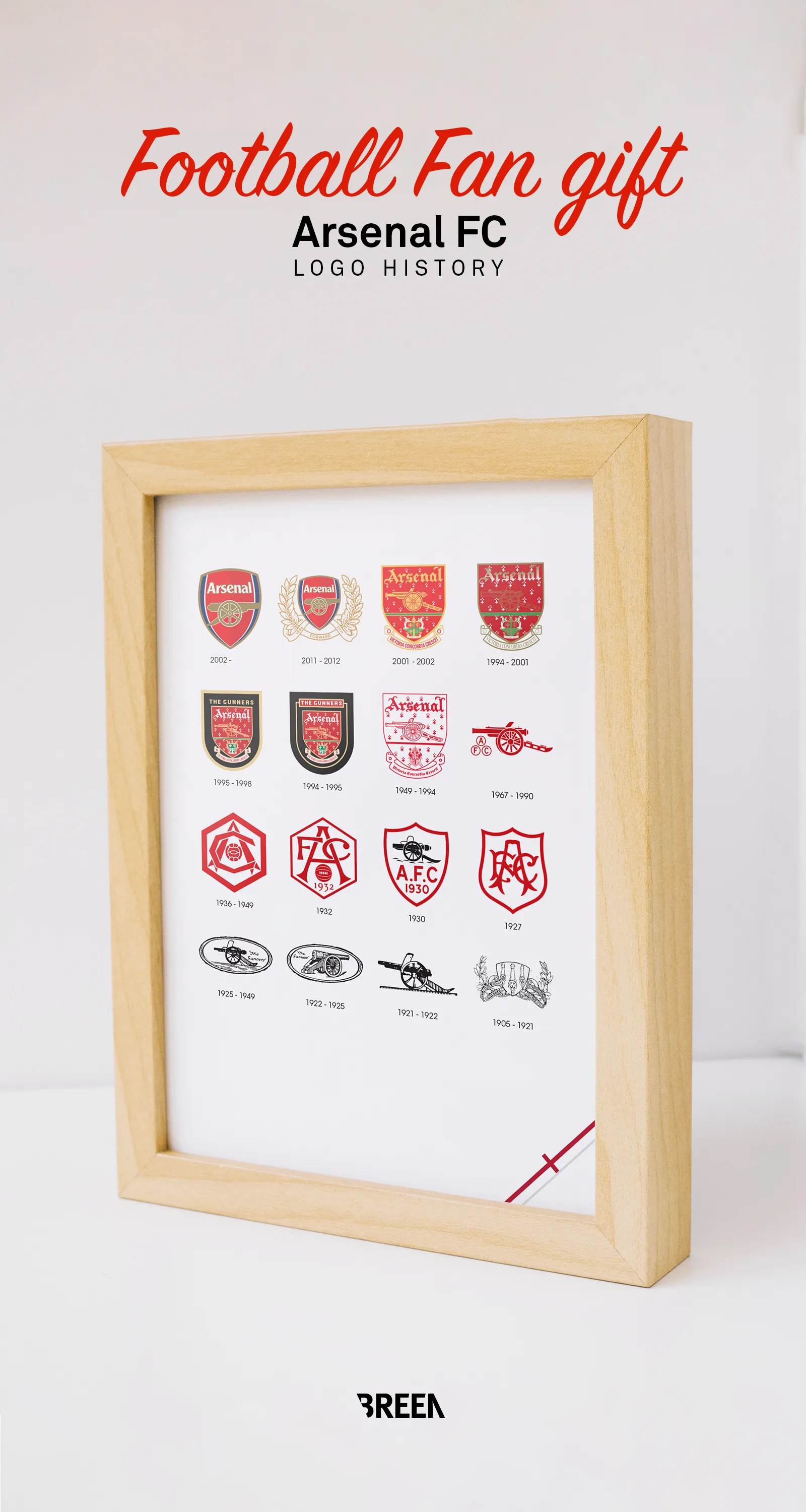
The Evolution of Arsenal: Premium Logo History Infographic (1886-2026)
Product Details
Size
Framed A5: 167 × 228 mm / 6.6 × 9 inch
Unframed A5: 148,5 × 210 mm / 5.8 × 8.3 inch.
Frame / Unframed
With a framed print you'll get a premium FSC®-certified pine wood frame with glass that can stand upright or hang on a wall. Optional colors in black, white and wood.
Paper
300 g/m² matte coated paper.
Gift wrap
Neatly wrapped with durable paper and a ribbon so you can send your gift directly to that special person.
Shipping & Returns
Shipping
Orders ship within 2–5 business days from the Netherlands. Unframed prints: €4.90 NL / €9.90 EU / €14.90 ROW. Framed prints: €6.90 NL / €9.90 EU / €24.90 ROW. Free Worldwide Shipping on all orders over €75.
Delivery
EU: 3–7 business days. UK/US/CA: 5–12 business days. Rest of world: 7–21 business days.
Returns
30-day hassle-free returns. If you're not satisfied, contact us for a full refund or exchange.
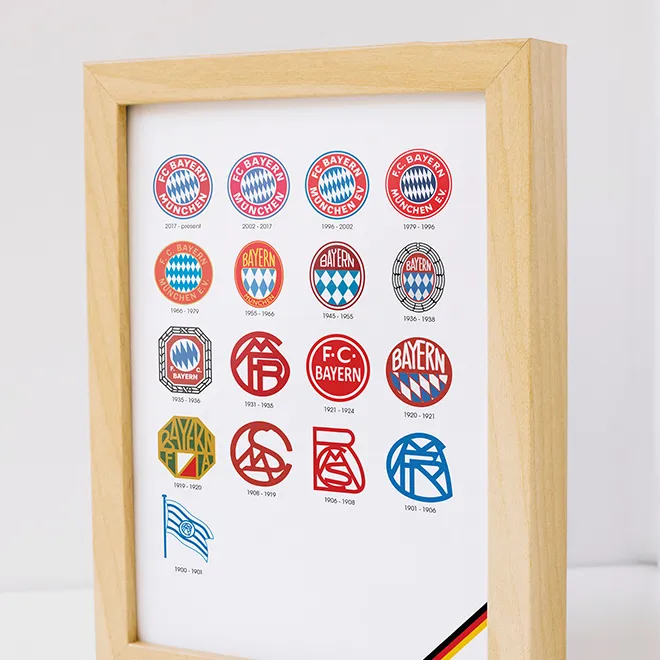
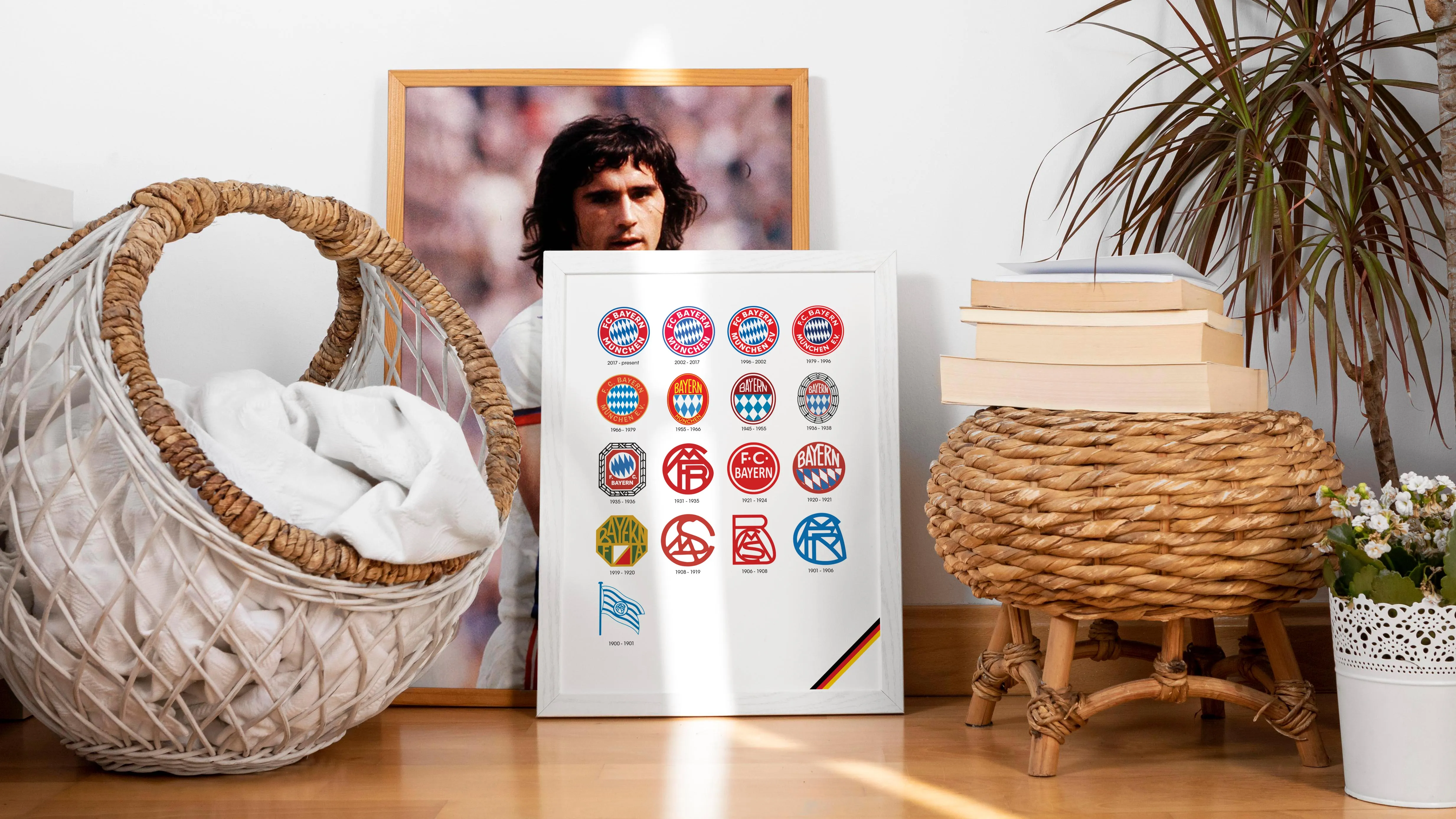
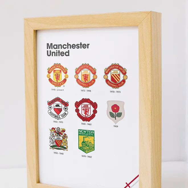
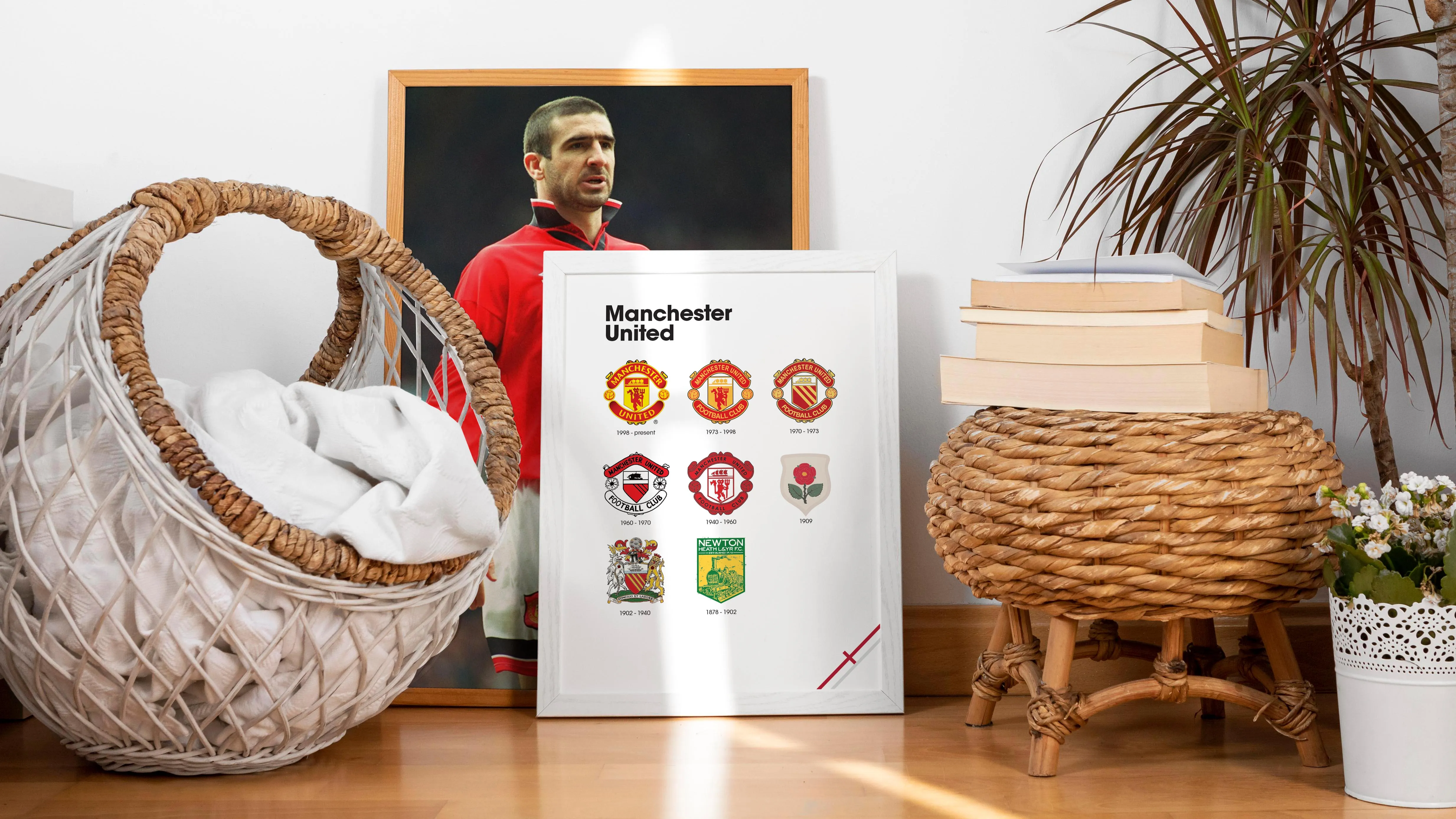
138 Years of North London Identity
Arsenal's story starts in 1886 as Woolwich Arsenal, formed by munitions workers at the Royal Arsenal. Those military origins shaped the club's earliest symbols—the cannon, the Woolwich coat of arms—and gave rise to the Gunners nickname. This poster traces that visual language from its industrial roots through Herbert Chapman's Art Deco era to the Highbury years, where the badge became unmistakably modern.
Every revision on this timeline reflects the club's evolution: from South London workshop to North London institution, from hand-drawn heraldry to a streamlined identity built for global recognition. If you watched The Invincibles lift the trophy or still hear "North London Forever" in your head on matchday, this is your archive.
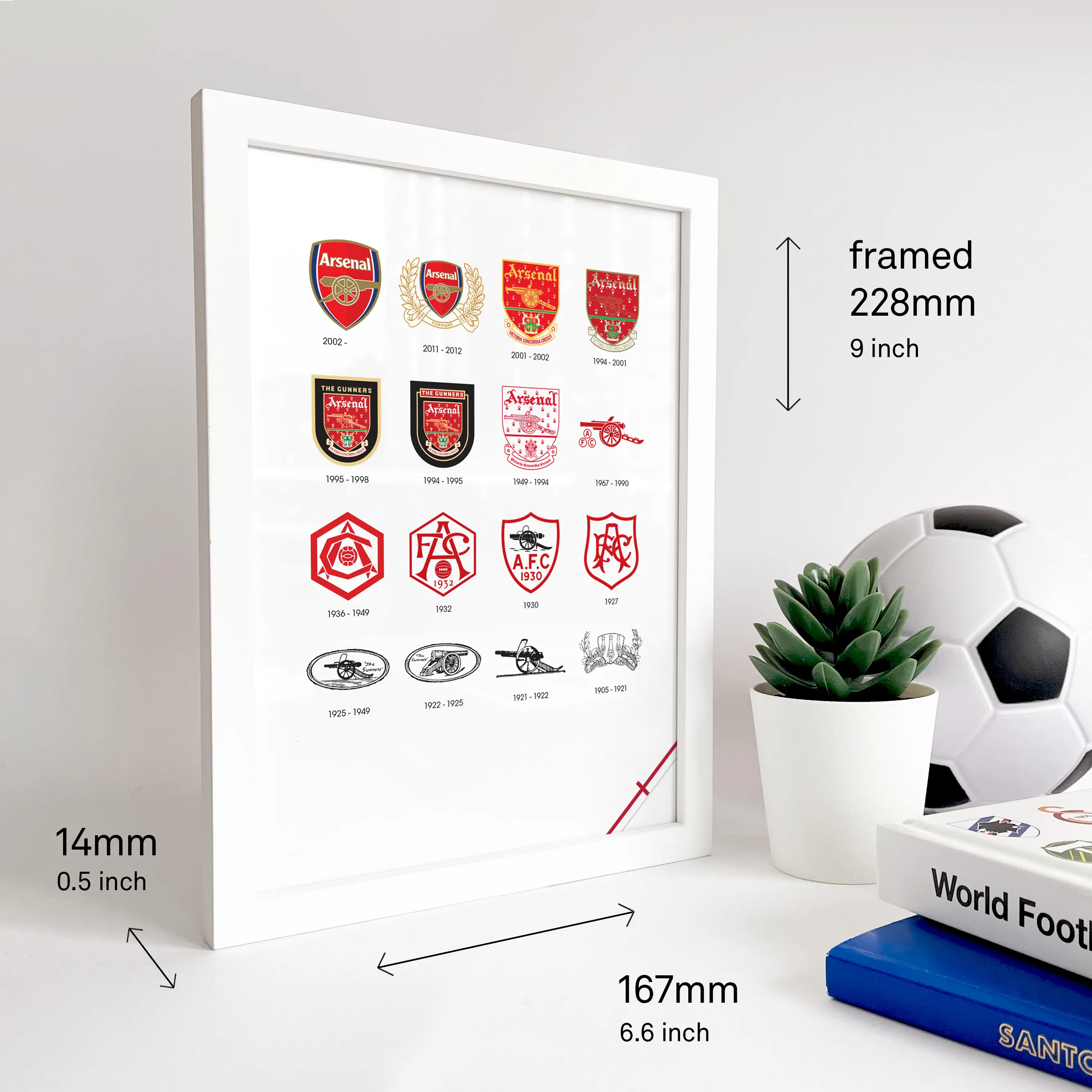
Hand-restored for collectors
Every badge in this timeline was digitally restored to preserve the fine details that don't survive low-res reproductions. From the 1886 Woolwich crest to the 2002 rebrand, each mark is rendered at print-ready fidelity. For the full history—cannon orientations, motto eras, and more—see the reference section below.The Orientation Shift
The cannon faces East in 1922, then West by 1925—a subtle change with lasting significance.
Victoria Concordia Crescit
"Victory Through Harmony" anchored the crest from 1949 to 2002.
The 2002 Rebrand
Gold accents, refined cannon, and a modern typeface for a new era.
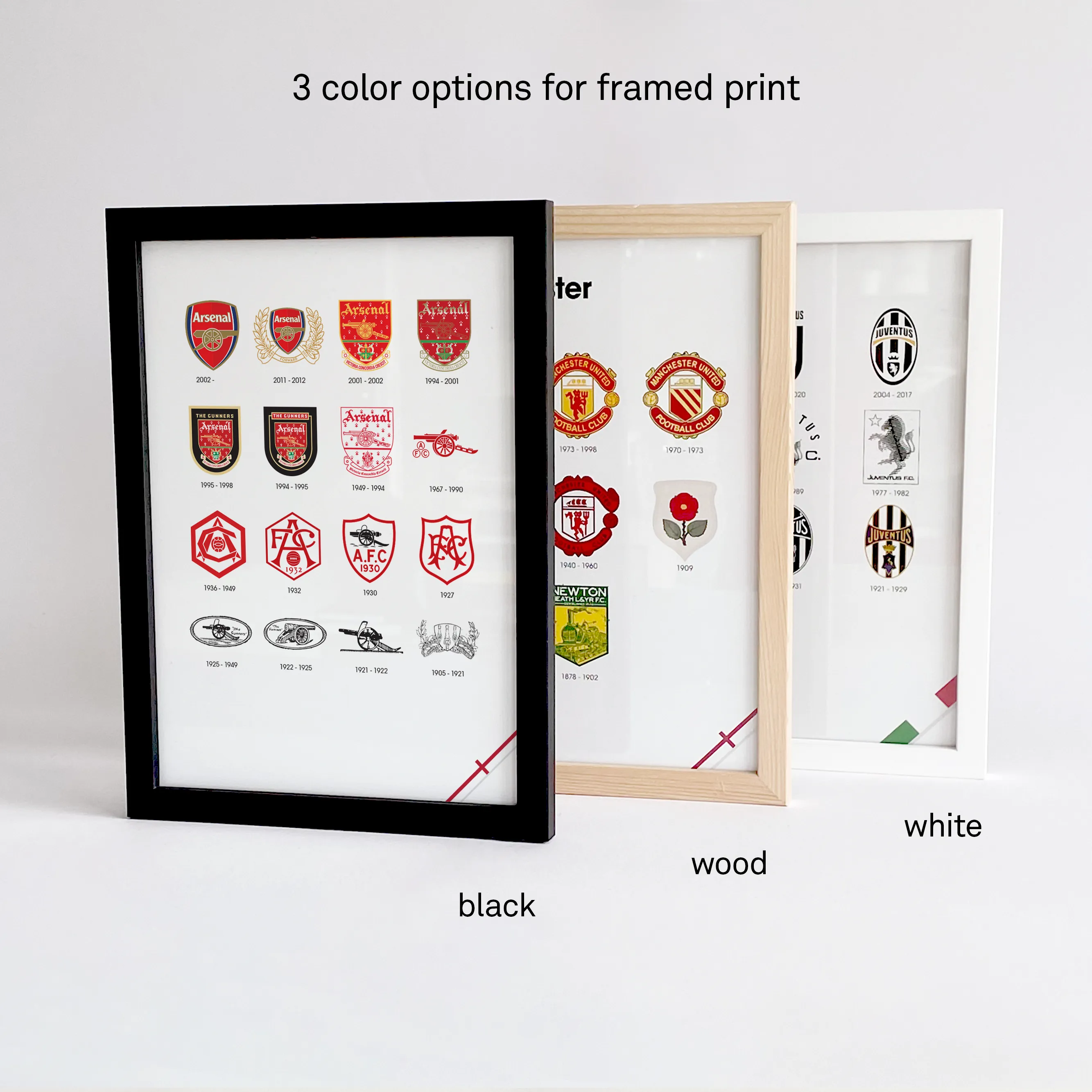

Ready to frame or gift
Choose from black, white, or oak wood frames—each FSC®-certified with glass and a built-in stand. Add gift wrap for a ribbon and personal note, ready to send directly to any Arsenal supporter.
The Story of the Arsenal Logo: A Collector's Reference
Arsenal poster: Arsenal logo history, curated for collectors
The Orientation Shift
In 1922, the cannon is shown facing East; by 1925, it turns West. The shift wasn't just symbolic—it improved design simplicity and reproducibility across print, embroidery, and small-format uses.
Victoria Concordia Crescit: The Story of a Motto
Victoria Concordia Crescit—"Victory Through Harmony"—defined Arsenal's crest language from 1949 to 2002. It isn't decoration; it's a mission statement that frames the club as disciplined, unified, and strategically modern.
On the badge, the motto anchors the cannon and surrounding heraldic elements into a complete narrative. In practice, it aligned with the club's self-image through the Highbury years: controlled, intelligent football and a clear institutional identity.
The 2002 Rebrand
A full deep dive into the 2002 rebrand—refining the cannon, moving into a gold-accented palette, and replacing the gothic "Arsenal" wordmark with a sleek, contemporary typeface built for modern media.
Arsenal logo history poster: from Woolwich to Emirates identity
This timeline reads the badge as design history: materials, constraints, and cultural context. It includes the transition away from ornate marks toward a cleaner, more legible system suited for mass reproduction and global visibility.
Collectors will recognize the inflection points—when details are removed for clarity, when typography modernizes, and when the cannon becomes the primary signature. It's the difference between "a crest" and a coherent identity system.
Museum-Grade Specs
Printed at Giclée quality using archival pigments for clean edges, stable color, and fine micro-detail. The result is controlled contrast that stays readable at close viewing distance—exactly what an Arsenal logo history poster needs.
Each print is engineered for ink-deep absorption into 300g/m² fibers, minimizing glare while preserving saturated reds and crisp blacks. It's a collector-grade Arsenal poster built to live on a wall for decades, not a season.