The Evolution of Manchester United: Premium Logo History Infographic (1878-2024)
Product Details
Size
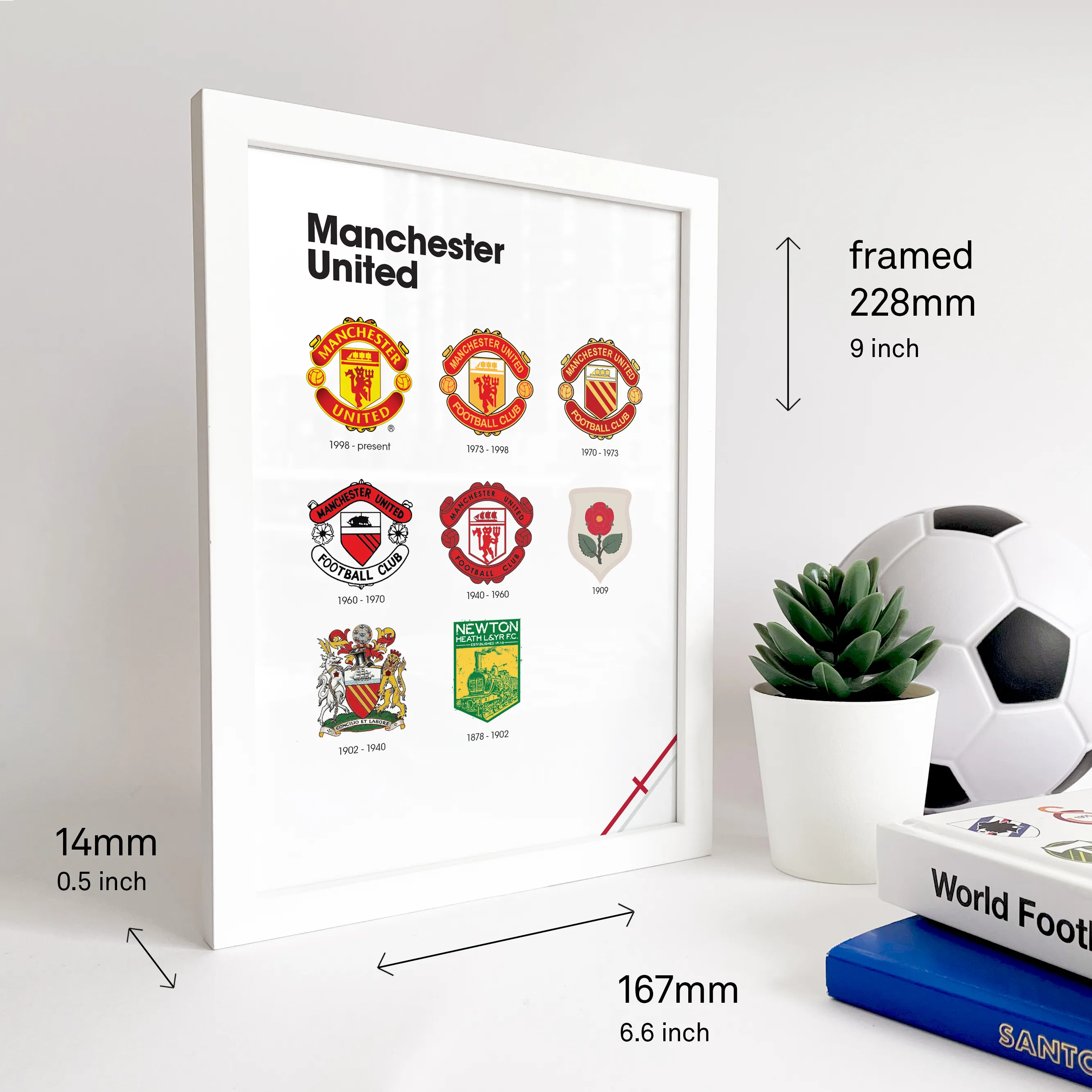
Framed A5: 167 × 228 mm / 6.6 × 9 inch
Unframed A5: 148,5 × 210 mm / 5.8 × 8.3 inch.
Frame / Unframed
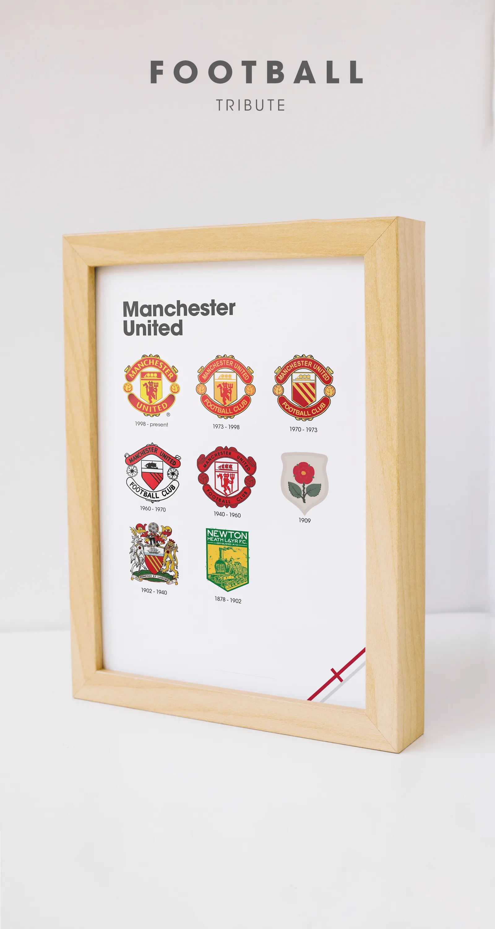
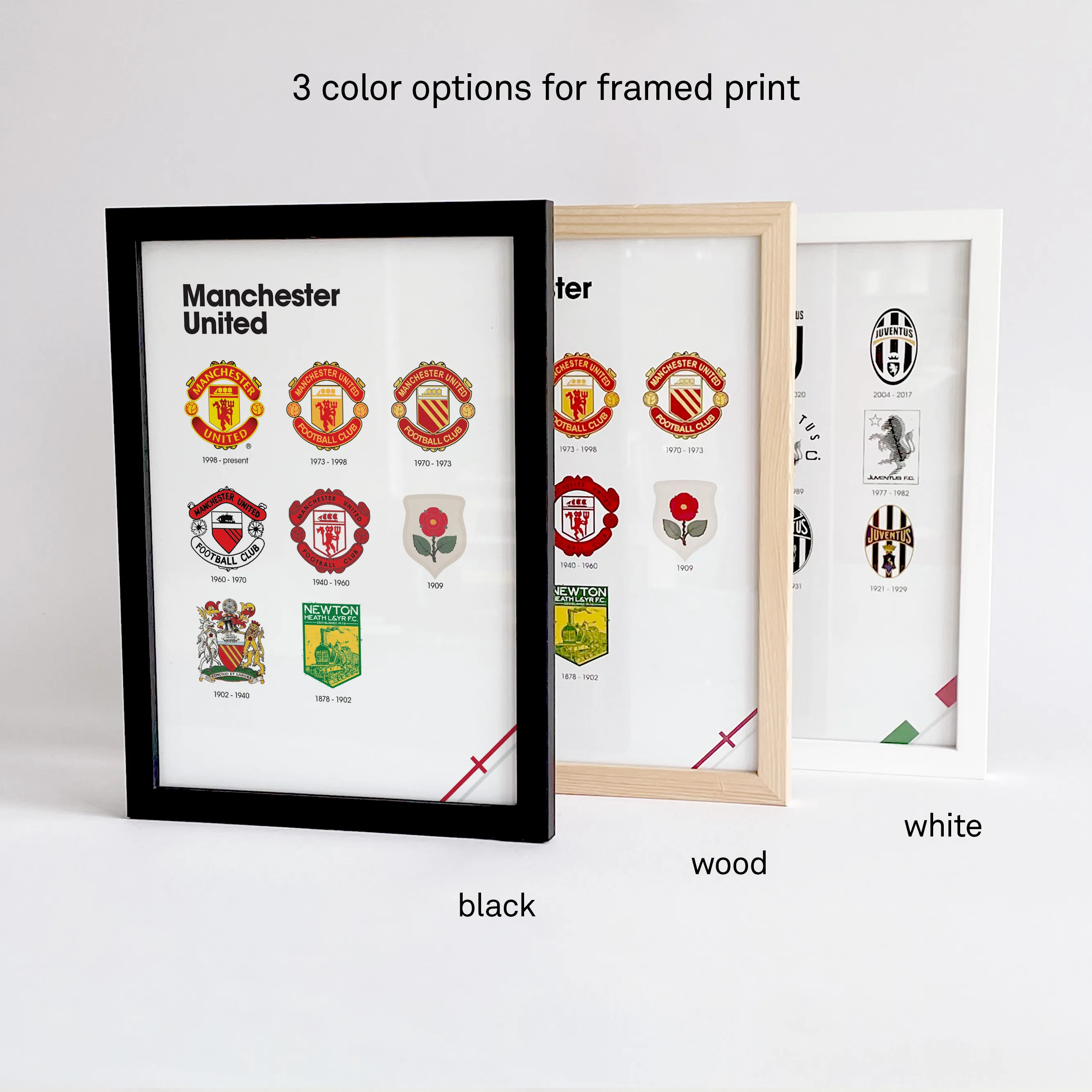
With a framed print you'll get a premium FSC®-certified pine wood frame with glass that can stand upright or hang on a wall. Optional colors in black, white and wood.
Paper
300 g/m² matte coated paper.
Gift wrap
Neatly wrapped with durable paper and a ribbon so you can send your gift directly to that special person.
Shipping & Returns
Shipping
Orders ship within 2–5 business days from the Netherlands. Unframed prints: €4.90 NL / €9.90 EU / €14.90 ROW. Framed prints: €6.90 NL / €9.90 EU / €24.90 ROW. Free Worldwide Shipping on all orders over €75.
Delivery
EU: 3–7 business days. UK/US/CA: 5–12 business days. Rest of world: 7–21 business days.
Returns
30-day hassle-free returns. If you're not satisfied, contact us for a full refund or exchange.
146 Years of Manchester Heritage
Manchester United's story begins in 1878 as Newton Heath LYR, formed by workers of the Lancashire and Yorkshire Railway. Those industrial origins shaped the club's earliest identity—practical, working-class symbols that would evolve into one of the most recognized crests in world football. This poster traces that transformation from railway roots to the Theatre of Dreams.
The timeline documents pivotal moments: the 1902 reorganization that gave the club its name, the post-war rebuilding under Sir Matt Busby, and the Munich Air Disaster that forever changed the club's relationship with its badge. Every revision reflects how Old Trafford became a global institution.
Hand-restored for collectors
Every badge in this timeline was digitally restored to preserve the fine details that don't survive low-res reproductions. From the Newton Heath crest to the 1998 modernization, each mark is rendered at print-ready fidelity. For the full history—see the reference section below.The Ship in Sail
Derived from Manchester's coat of arms, symbolizing the city's trade links and the Ship Canal.
The Red Devil
Adopted in the 1970s under Sir Matt Busby to create a more intimidating identity.
1998 Modernization
"Football Club" removed for the sleek global identity we recognize today.

Ready to frame or gift
Choose from black, white, or oak wood frames—each FSC®-certified with glass and a built-in stand. Add gift wrap for a ribbon and personal note, ready to send directly to any Red Devils supporter.
Manchester United Logo History: A Collector's Reference
Manchester United logo history: curated for collectors
1878: Newton Heath LYR and the origin story
Manchester United's story begins in 1878 as Newton Heath LYR, formed by workers of the Lancashire and Yorkshire Railway. Early identity cues were practical and industrial—more signal than spectacle—yet they set the foundation for a club that would later become one of the most recognizable brands in sport.
1902: the name change to Manchester United
In 1902, the club reorganized and adopted the name Manchester United. That shift wasn't just administrative: it marked the transition from railway roots to a city-scale identity, opening the door for symbols tied to Manchester's municipal heraldry, including the ship and shield motifs that appear throughout later crests.
Munich and memory: how tragedy shaped identity
The Munich Air Disaster became a permanent inflection point in the club's narrative. Over time, commemorative language and heritage emphasis intensified; the badge carries more than decoration—it carries memory, continuity, and the sense of rebuilding that defines the modern Manchester United story.
The coat of arms and the three stripes
Manchester's heraldic language informs key elements of the crest system. The three stripes reference the three rivers of Manchester: Irwell, Irk, and Medlock—a geographic signature that anchors global visibility in local origin.
The Red Devil era and the modern crest system
The 1970s era introduced the Red Devil as a central identity device, reinforcing an intimidating, unmistakable silhouette. Later revisions refined typography and simplified reproduction for modern media, culminating in the 1998 modernization that pushed the club toward a sleek global identity.
Museum-Grade Specs
Printed on museum-grade 300g/m² matte stock to minimize glare and preserve detail at close viewing distance. Finished to Amsterdam studio quality—built to live like a quiet gallery piece, not disposable merch.